how to write about art
on Rachel Jones's toothy landscapes ✦ and lessons from Peter Schjeldahl and David Salle
On a Saturday morning in April, my friend and I hurried through San Francisco’s downtown, into a sharp, slicing wind that pressed the trembling weeds into the sidewalk. We turned from Folsom onto Fremont, from Fremont onto Mission Street, almost walking past the discreet entrance to the MoAD. We hadn’t seen each other for a few months, and we hadn’t really seen any art in the last few months—a particular kind of famished, searching emptiness.
From now until September 1, the MoAD has an exhibition of oil pastels by the British artist Rachel Jones. It’s Jones’s first solo museum exhibition in US, but she exhibits regularly in the UK—I first came across Jones’s work at the Hayward Gallery’s “Mixing It Up: Painting Today” in 2021, where her work was shown alongside artists like Lubaina Himid and Oscar Murillo. She also had a solo show at Chisenhale Gallery in 2022 titled say cheeeeese. I didn’t see it, but I’m at peace with this. The Chisenhale space is beautiful, and her works for the show look beautifully installed. I think the MoAD work is better—mostly because it’s funnier.
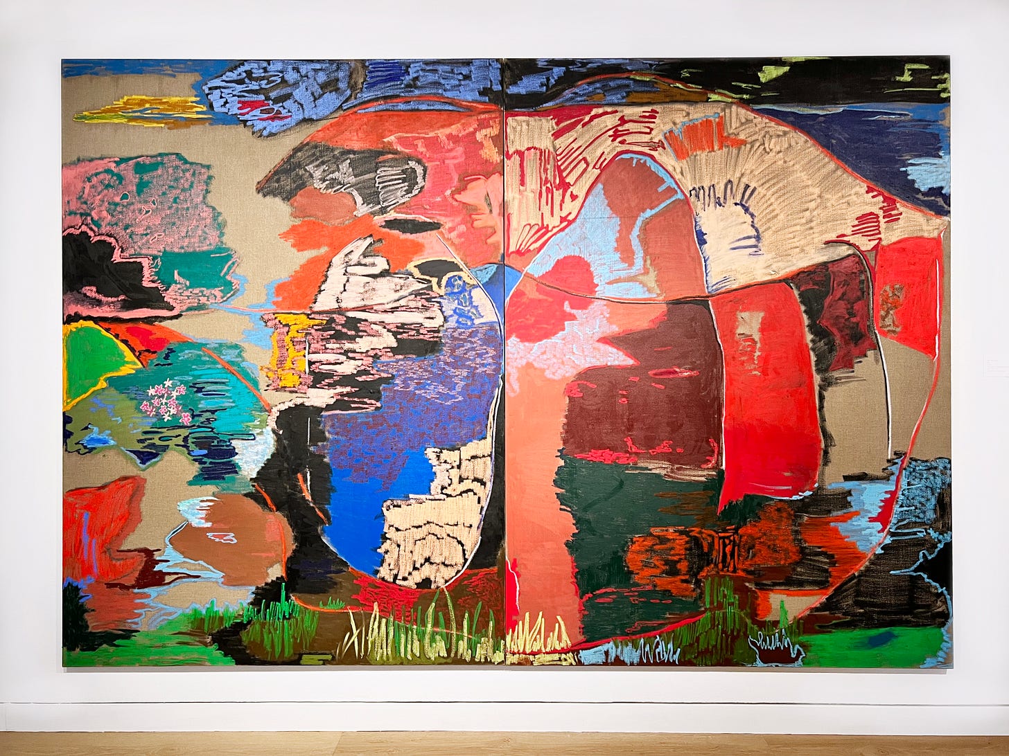
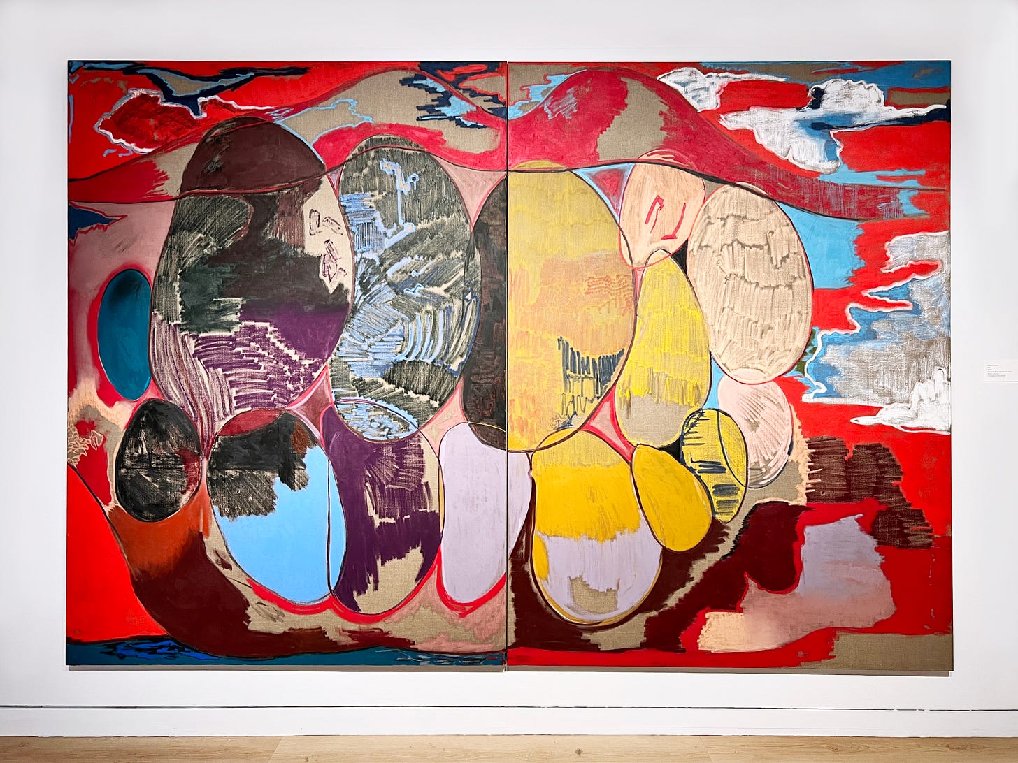
Jones’s exhibition is on the third floor of the museum. It has the enigmatic and exciting title !!!!—which is exactly how I felt when I first walked in and was confronted with this vast, expansive landscape of color:
I immediately loved this work, for all the strange, energetic, inarticulable reasons one falls in love with abstract art: large swaths of color, densely pigmented or soft in texture; bold, slicing gestures across the canvas; remarkable color pairings that pulled me closer to the canvas.
The canvases are large: over 3 meters wide and 2 meters tall. As I walked closer, the swaths of color became increasingly more and more detailed:
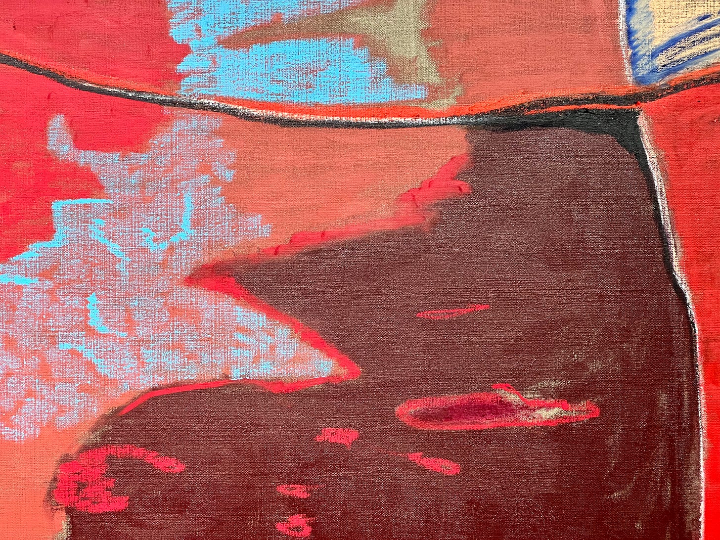
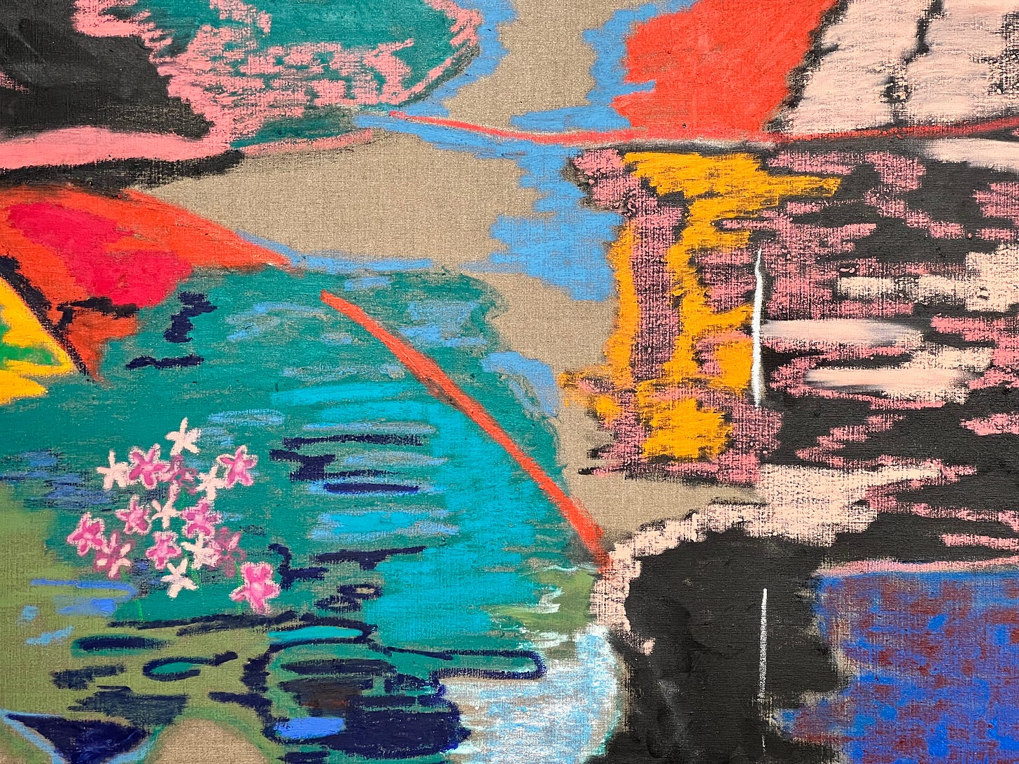
Above, for instance, you can see the bright orange (top left) suddenly meeting a lovely dark green-gray, the two colors meeting each other in a flexing, tense collision: bright and warm, dark and subdued. Then there’s the chalk-cream marks applied over the green-gray—you can almost imagine Rachel Jones’s hand moving back and forth, deliberately, trying to get at just the right level of spontaneity and control.
And underneath that—the small part of the canvas that felt loveliest to me, that felt like my little piece of the painting: the hazy, almost cloudlike petal pink lines that seem superimposed over the dark green, the patch of electric blue mixed with burgundy. The pink feels dimensional, like a filmy, delicate gauze thrown over the darker colors. The texture reminded me quite a bit of the xiangyun cloud pattern you’ll see a lot in Chinese and Sinosphere art:
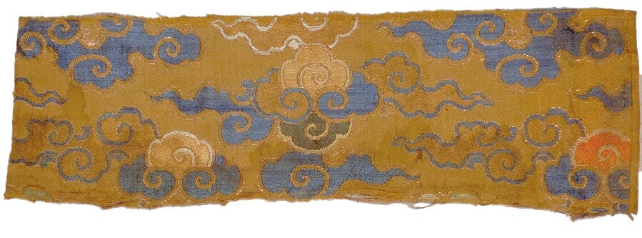
I find myself inevitably and irresistibly drawn to anything that evokes—on a purely formal level—this kind of cloud pattern; and it felt as if Rachel Jones’s oil pastels were achieving the kind of graceful, heavenly elegance of these auspicious clouds.
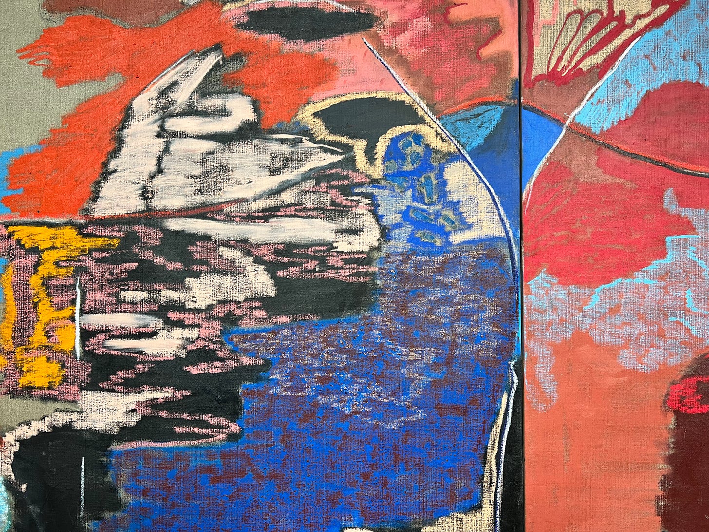
I remember kneeling in front of the canvas so I could look at this section—where an electrifying, airy blue cloud was tucked into the corners of a burgundy form, limned in a vivid red. There was something very moving—again, in that incomprehensible way that abstracted art often attains—about the soft pastel textures alongside very sharp, harsh lines: the black and white and red slicing through the canvas, creating borders and forms.
And it was so satisfying to come up close to the canvas, to remember: Colors occupy a surface! Physical art, even 2D art, is on a surface, it’s never just smooth and slick. Online, colors are always painted evenly and blandly on top of pixels, and any texture is falsified after—with a noise filter or a computationally rendered linen surface. In person, facing Rachel Jones’s imposing and exuberant canvases, I was reminded of how artificial colors on a screen can be, how impoverished they are next to real life, real colors, confronting your gaze.
There are moments that are more explicitly figurative, like these charming petal pink and fuschia flowers, blooming on top of—I imagined—a still and verdant backdrop of greenery. The olive green and navy blue welling up underneath the flowers felt like shadows, swirls of water, something naturalistic that eluded my eye but felt pleasantly situated in reality all the same.
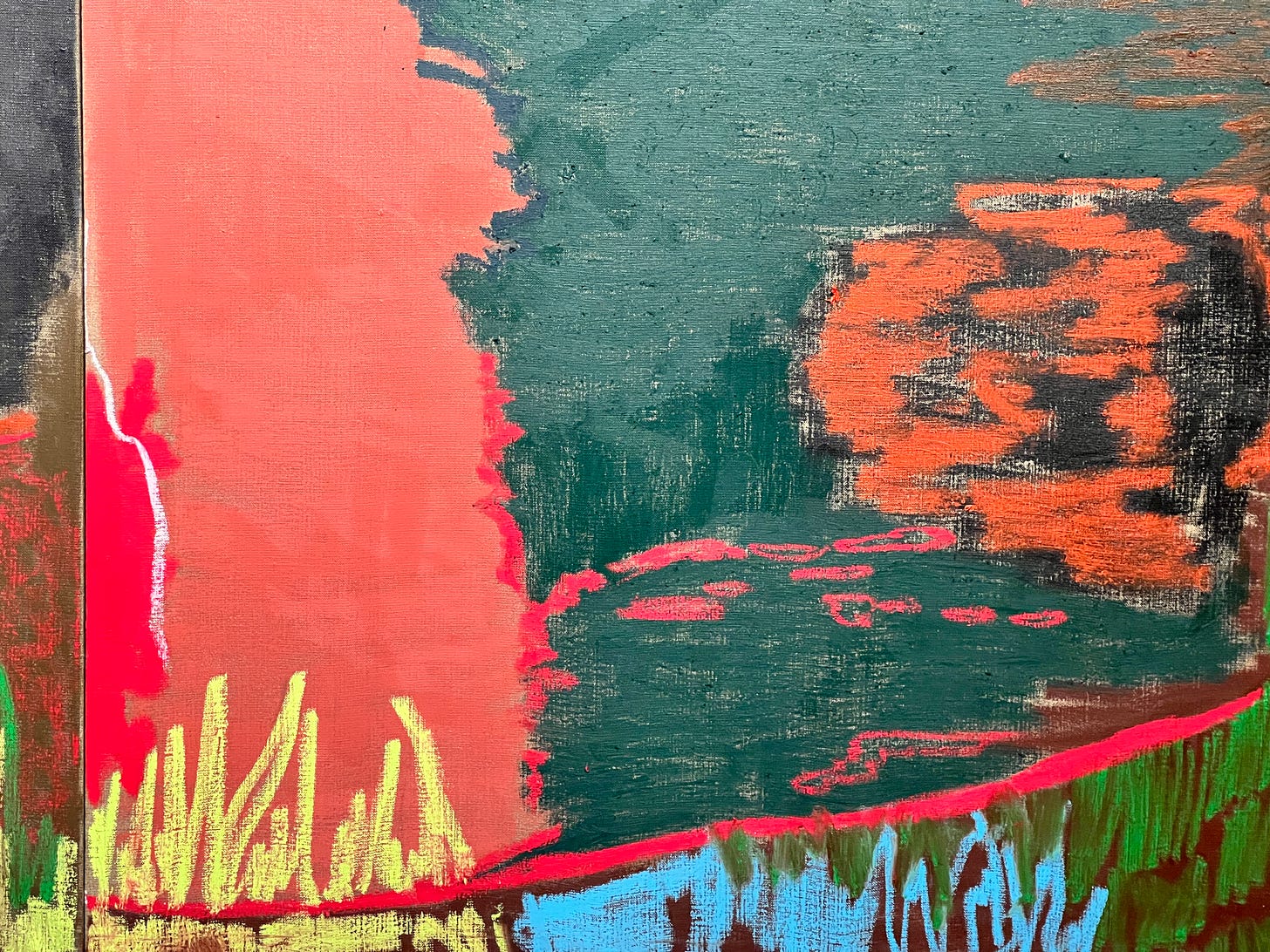
And I imagined that these upright strokes—the yellow and blue and green fringing the bottom of the image above—were grass, growing exuberantly and wildly before being trimmed away by a slashing red line.
Because I had been drawn in by the work, drawn into a very close and detailed examination of specific colors and lines and gestures, I couldn’t quite see what all these slashing lines were adding up to. I had to step away from this first painting, and go to the next one, before I realized:
Rachel Jones is depicting mouths! And teeth!
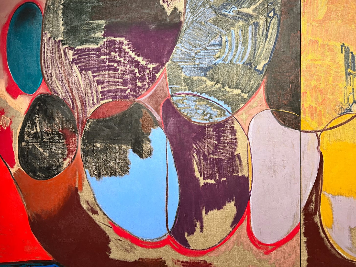
The canvases all have large mouths, barely contained, lips curved wide in a smile. The edges of the lips were the slashing lines I’d seen in the previous work—and here it was even more obvious, because the large, bulging shapes of teeth were more present. Each tooth was an immense pigmented form, delineated by exciting chromatic collisions:
I loved the lavender tooth especially—intersected above with black and yellow, outlined below with an almost crudely thick red shadow.
In the museum I could move close to the canvas, then move back, and see how Rachel Jones’s handling of color created a certain figure–ground relationship up close, and created a different figure–ground relationship when I was standing far away. I could be confronted by all the colors at once; I could come up close and attentively observe just two colors, pushing up against each other.
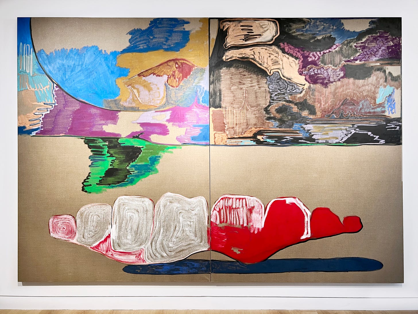
It’s surprising and lovely how much Rachel Jones gets out of this motif: mouths, teeth. Halfway through the room was this stark landscape that seemed like part of a lower dental arch, or maybe a denture: lonely, isolated teeth against an unpigmented linen landscape.
My friend and I were reminded of the empty, strange landscapes of surrealist painting—it feels a bit like Dalí, no? The bare teeth and a churning, intense, heady chaos of color in the sky:
This is how I instinctively encounter art. It’s all about color and line and form, about stepping closer and stepping away; a direct, largely unmediated encounter with the sheer phenomenological power of a work.
On the MoAD website, Rachel Jones’s art is described as follows:
Rachel Jones explores a sense of self as a visual, visceral experience. In her paintings, she grapples with the challenges of finding visual means to convey abstract, existential concepts. In depicting the psychological truths of being and the emotions the seen gender, abstraction becomes a way of expressing the intangible. The artist repeats motifs and symbols across her series to create associative, even familial, relationships between them, underscoring their kinship as part of her ongoing investigation of identity.
The figure is notably abstracted in her works, as Jones is interested in "using motifs and color as a way to communicate ideas about the interiority of Black bodies and their lived experience." Abstracted mouths and teeth suggest a symbolic and literal entry point to the interior and the self. Within this vivid inner landscape, oral and, more recently, floral forms emerge and recede from view. Her expressive use of color becomes a way of provoking or communicating with viewers, who bring their own lived experiences and cultural backgrounds to the interpretation of her works.
But that’s museum copy, written in museum voice. What I’m drawn to, in my own writing and the work of others, is not the heady, abstract phrasing “a symbolic and literal entry point into the interior” but the visceral feeling of realizing: There are teeth in this canvas! I’ve just seen them, I’ve just noticed them, and now everything about my perception has shifted.
It’s one thing to say that viewers “bring their own lived experiences and cultural backgrounds to the interpretation of [Jones’s] works”. But what I want to tell you is how I see the xiangyun clouds in the oil-pastel textures that Jones is creating, how I see xiangyun clouds everywhere because to me they’re the most beautiful motif in art—and I want to know what motifs other people are always seeing in art. What do we find beautiful, and how do we find the words to describe that beauty? How do we use art as a way of accessing our own aesthetic convictions?
This way of experiencing art seems very aligned with Jones’s aspirations for her work. In an interview—included in the publication that accompanied her Chisenhale show—Jones says:
I want the work to be accessible to people. I don't presume to do it successfully, but my intention is that someone has an access point into the work. From that, they can go wherever they want. They can learn things that are about my specific cultural context, my experience and my interest in painting. Or they can just enjoy it on a surface level and think, 'Oh, these colours, they emit something.’ However far along in that journey they get, I want them to feel like they are encountering something which provokes a response, or requires an action. I don't ever want to provide people with a passive viewing experience, or for them to feel like they need to already know about painting to talk about this painting.
Close looking, close reading
A few days after seeing Rachel Jones’s exhibition, I started reading a library copy of David Salle’s How to See: Looking, Talking, and Thinking about Art. Salle is a painter and a critic who’s written for Art in America, Modern Painters, and other publications. He has strong feelings about how art should be discussed and written about, and How to See opens by describing the kind of art writing that Salle despises:
Critical writing in the last forty or so years has been concerned primarily with the artist’s intention, and how that illuminates the cultural concerns of the moment. Art is treated as a position paper, with the artist cast as a kind of philosopher manqué…A visit to any of today’s leading art schools would reveal one thing in common: The artist’s intent is given far greater importance than…[the] realization, than the work itself. Theory abounds, but concrete visual perception is at a low ebb.
Salle notes, with obvious disdain, that “Many people who write and talk about art have no particular visual fluency, something I used to find surprising but no longer do.”
For Salle, attention to the visual and the specific—the particular brushstrokes in a painting, for example—is the best way to understand a work of art and the higher-level intentions contained within it:
Someone made something—or caused it to be made—that has certain qualities. Those qualities are related to the artist’s intention, but because they reside in material form, speak a different language…
[T]he kinds of intelligence that one finds in a poet’s use of meter, a painter’s inflections of the brush, or a musician’s phrasing are not of a lesser sort—they are just more difficult to describe. Making the effort to describe just those sorts of perceivable effects enlarges our feeling for art generally. Art is more than a sum of cultural signs: It is a language both direct and associative, and has a grammar and syntax like any other human communication. The act of paying close attention to what someone made, in all of its particulars, is what stimulates an authentic, as opposed to a conditioned response.
I found myself energized by Salle’s words, because they feel like an argument for engaging with visual art through close looking, in the same way that literary art can be engaged with through close reading.
In literary criticism I’m always frustrated by writing that focuses too much on what “happens” in a novel (the plot) and what the novel “means”. Okay, so maybe the novel is a commentary on feminism and gender relations and class struggle and contemporary anomie—but how did the novel comment on these things? What formal decisions were made? Was it the rhythm of the sentences that created a feeling of anomie? Was it the dialogue between two characters of specific class positions—who spoke more or less, perhaps—that made the supposed commentary on class struggle happen? Is it a feminist novel because it was written by a woman? Because it stylistically evokes iconic novels by other women? What specifically is happening, and can the critic help me see how specific formal moves led to the analysis they’re offering?
Perhaps it’s the same in art writing—it’s too easy to lean on words that seem theoretically rich and yet have nothing to say about what’s actually in front of us, what our eyes encounter on the canvas. Here, too, Salle is acerbic about the tendency to talk about the ideas an artist has, instead of the form used to convey those ideas:
Artists have long been involved with all manner of ideas, but really big ideas are few and far between…average-sized ideas, that is to say most ideas, are easy.…Often what passes for an idea is, on closer inspection, really propaganda—someone wants something, wants to promote something. The hard part is finding a form. The most convincing works tend to be those in which the thinking is inseparable from the doing.
The thinking is inseparable from the doing. The idea is nothing without its execution. We actualize our ideas—and our ideals—by embodying them in an artifact or an action. That’s where the work is, and that’s where art and literature come alive.
I’m finding myself energized by Salle’s approach to art writing, which demands that we pay attention to the form—and how we attend to form:
We need to pay attention to what a work of art actually does—as distinct from whatever may be its supposed intention. How does one learn to make these kinds of distinctions? Most of what I’ve learned about art has been on the run, from looking, making, and looking again, and also from listening to the very bright talk that has always enlivened the art-world air.
Narrating the process of looking
As I read Salle’s book, I began to wonder if writing about art is best done by critic-practitioners—people who can paint and write about painters, for example, and can draw on their own experiences with a brush, canvas, and paint. At one point, Salle praises the painter Willem de Kooning for a remarkably visceral description of a work by Larry Rivers: like “pressing your face in wet grass.”
But there are pure art critics who can get at this visceral, satisfyingly embodied approach to writing about art. One such critic is Peter Schjeldahl, who spent decades as the New Yorker’s art critic. For the past year now, I’ve been picking away at Hot, Cold, Heavy, Light, which collects 100 pieces written by Schjeldahl from 1988–2018.
In the introduction, Jarrett Earnest describes Schjeldahl’s style like this:
The mode is called “art criticism,” but, taken in quantity, Schjeldahl’s performance of it reads more like experimental first-person literature, without pretension, and revelatory aesthetic philosophy, without pedantry.
The lack of pretension makes Schjeldahl’s writing accessible without feeling dumbed-down. And Schjeldahl’s loving attention to the art in front of him—and the sheer style of the sentences he used to describe it—can activate the reader’s own love of art. He is “narrating his own process of looking, thinking, and feeling—making it seem like something that anyone with a pair of eyes and an open heart can do.”
In a beautifully physical metaphor, Earnest suggests that “For Schjeldahl, seeing is a contact sport that demands a precision of language.” One example is a Schjeldahl’s review of a Willem de Kooning show, which opens with an incredible kinetic exuberance:
Like the bus in the thriller Speed, this masterpieces-only retrospective never slows down and thus is hard to board. How I did it was to stroll nonstop through the show, finally pausing in the last room with the eerily deliberate paintings of de Kooning’s dotage that lay out rudiments of his genius like silk ties on a bedspread. I studied those works that have no historical precedent that I can think of. Then I left the show and nonchalantly walked back in at the beginning, going straight to Pink Lady (1944) and giving it my full attention. The effect was like a plane taking off, when the acceleration presses you against the seat. The painting’s violent intelligence detonated pleasure after pleasure. When I turned around, everything in the show was singing its lungs out. Half an hour later I was beaten to a pulp of joy. I’ll rest and go back for more.
It’s hard not to love a critic that can situate an artist like de Kooning in the broader trajectories of 20th century art—and yet write, with winsome directness, about being “beaten to a pulp of joy” by the sheer beauty of a painting.
Hot, Cold, Heavy, Light is full of these virtuosic descriptions—like when he describes Willem de Kooning’s position on the figuration–abstraction spectrum by saying: “His art is not abstract, just relentlessly abstracting. Memories of depiction cling to every stroke.” Reading Schjeldahl makes me cling onto every sentence, enthralled by every verb and adjective he deploys.
And Schjeldahl’s writing has such an uncomplicated, steady, wholesome directness. Similes are vivid and direct—The effect was like a plane taking off, when the acceleration presses you against the seat. It’s pure joy to read him.
In my second-ever post on this Substack, I wrote about the importance of descriptive language:
mere description
We describe things. All the time. And those descriptions can be ordinary, unremarkable, obvious—or they can be strange, surreal, exciting, unexpected. When I write I’m always trying to do the second kind of description (good, interesting, literary description) and avoid the first. But it’s hard to describe things well, like
It’s so easy to think of “mere description” as something workhorse and commonplace, but writers like Salle and Schjeldahl remind us that simply describing what we see—and how we feel about what we see—is one of the highest forms of writing possible. That’s certainly the case for criticism, where so much writing skips ahead to the verdict (Is the novel good? Does it suck?) without giving us any of the evidence. The evidence is where the experience of art lives.
Five recent favorites
An allium-forward ikebana arrangement ✦✧ Computer programs for the kitchen ✦✧ Anne Carson on doing things slowly ✦✧ Typographic collaborations with the sun ✦✧ Wordsworth on taste
Allium-forward ikebana ✦✧
Speaking of form, and formal beauty—I love contemporary ikebana arrangements that take some unexpected object and draw out all that is beautiful and strange and remarkable about it. Here’s a wonderful example: an arrangement featuring a large leek, perfectly balanced on a tiny vessel:
Computer programs for the kitchen ✦✧
Surely I’m not alone in finding both the process of cooking and the process of programming incredibly fun! Unfortunately, I have yet to find any tradwife-style content online that reflects these two interests. It’s so fun to tenderly simmer some vegetables over the stovetop for hours; it’s also so fun to sit in front of a code editor and write a small script just for fun. (Or for a poetic and artistic purpose—this is essentially what the School for Poetic Computation is devoted to.)

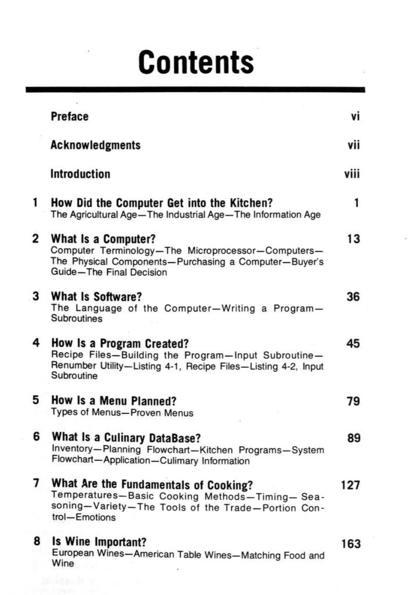
For those of us committed to both forms of pleasure—this instructional book from 1984 is extremely, extremely fascinating. Chapter 1 is titled “How Did the Computer Get into the Kitchen?” and goes through a fairly typical history of information: the abacus, the jacquard loom, IBM, Bell Laboratories, the ENIAC computer, the Apple II…

The rest of the book is equally delightful, with chapters answering questions like What Is Software?, How Is a Menu Planned?, and Is Wine Important?
Anne Carson on reading very slowly ✦✧
Kate Dwyer’s interview with the poet and classicist Anne Carson for the Paris Review is full of lovely moments. But one of the best moments (quoted by Sean Watson on Twitter) is when Anne Carson reflects on the slowness of learning a language and translating a text before computers:
I was teaching ancient Greek part of the time and writing part of the time. And the ancient Greek method when I was in school was to look at the ancient Greek text and locate the words that are unknown and look them up in a lexicon. And then find out what it means and write it down. Looking up things in a lexicon is a process that takes time. And it has an interval in it of something like reverie, something like suspended thought because it’s not no thought because you have a question about a word and you attain that as you go through the pages looking for the right definition, but you’re not arrived yet at the thought. It’s a different kind of time, and a different kind of mentality than you have anywhere else in the day. It’s very valuable, because things happen in your thinking and in your feeling about the words in that interval. I call that a hesitation.
Nowadays people have the whole text on their computer, they come to a word they don’t know, they hit a button and instantly the word is supplied to them by whatever lexicon has been loaded into the computer. Usually the computer chooses the meaning of the word relevant to the passage and gives that, so you don’t even get the history of the word and a chance to float around among its possible other senses.
That interval being lost makes a whole difference to how you regard languages. It rests your brain on the way to thinking because you’re not quite thinking yet. It’s an absent presence in a way, but it’s not the cloud of unknowing that mystics talk about when they say that God is nothing and you have to say nothing about God because saying something about God makes God particular and limited. It’s not that—it’s on the way to knowing, so it’s suspended in a sort of trust. I regret the loss of that.
I think all the time about doing things slowly, inefficiently—not because inefficiency is itself good, but because efficiency is not intrinsically good. Doing things faster and easier can shortcut a valuable mental state—a state of indecision and indeterminacy that offers fruitful poetic possibilities.
Typographic collaborations with the sun ✦✧
I can’t wait for summer: long, languid days in the sun, watching the trees casting shadows on the ground, and maybe casting my own, carefully-designed shadows onto other surfaces. This imag is from Rachel Shin, a graphic design student at RISD. Such a lovely design strategy—collaborating with the shadows and the light to create a transient typographic experience.
Wordsworth on taste ✦✧
Sometimes a sentence leaves an indistinct and yet permanent impression in my head, and as I’m going through life—seeing art, reading literature, observing reality—the sentence continually intrudes, insists on its specific utility in interpreting my experiences, and yet I don’t have a clear enough hold on the sentence to learn from it.
For a few months now, I’ve had this phrase—Every great writer has to creates the taste that others enjoy him by—stuck in my head. But I knew it wasn’t the right phrase and the original phrase, and so I was very relieved to find the original again. It’s the English romantic poet William Wordsworth:
Every great and original writer, in proportion as he is great and original, must himself create the taste by which he is to be relished.
Thank you, as always, for reading and being here! The next post will be my usual everything i read in april 2024 roundup. If you’ve enjoyed this Substack, btw, please consider sharing it with a friend who’s really into staring at paintings, arranging vegetables, reading books, and compulsively collecting quotations. Or any of the other topics I usually cover…




thanks for the intro to this artist and timely reminder to visit a museum! I immediately thought of embroidery when you showed the up close shots of the texture of the paintings. What you wrote really resonated, I feel like I never “got” abstract art before being able to visit museums and experiencing the immense scale of the works and vibrancy of the colors in person.
I will be going to that Rachel Jones show and picking up Hot, Cold, Heavy, Light… post-haste!